Stinkoman 20X6: Reloaded/200
From Homestar Runner Fanstuff Wiki
Author's Comments
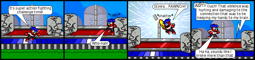
And here it is, the almost completely ordinary 200th Reloaded comic of lore! Enjoy the madness as Stinkoman uses his elite ninja wall-jump skills to wallop off the first segment of Stlunko's wall-antenna... with some crazy new jumping attack sprite that actually looks like a good uppercut when placed vertically, like out of some fighting game. And yeah, Stinkoman's line in panel three is pretty much a reference to Captain Falcon from Super Smash Brothers. Enjoying him a lot recently.
But I'm sure the main thing all you guys have noticed is the font. What just happened to the bold-faced size 10 Times New Roman that you know and love? Well, quite a while ago I read a webcomic guide that said to never use Arial, Comic Sans or Times New Roman for a comic. The first two were supposedly so overused that they are uncreative, dull and almost cliché, while Times New Roman is discouraged because it reminds readers of old newspaper print, which isn't good for what's supposed to be a fun webcomic.
-- WARNING: Long rambling ahead. Ignore if uninterested --
At first I got defensive and shrugged it off as just an elitist's opinion, expecially since most of the comics here are one of those three fonts. However after reading the same thing at a second source, I gave it more thought and realized just exactly how inappropiate my font actually was for a comic. Sure, no one really minded and we all got used to it, but that's no reason why I can't try improving. However switching a font that I've used for nearly 200 comics, which appears predominantly in nearly every one, is quite a daunting task. However with the 200th comic rounding the corner and still no ideas on how to make it special, I decided to shoot for it and see if I could find anything.
First of all, none of the fonts preinstalled on the computer made really good substitutes, though I expected this. So I went to the magical world of free online fonts! It... turned out to be much harder than I expected, expecially since a lot of online fonts are over-spectacular messes. Plus I had strict standards: I wanted my font simple, hand-written like, and not all-caps. Also the small size I require for my text didn't help, many perfectly fine fonts turn to crap when shrunk so heavily, and others just automatically anti-aliased, which I already know isn't wanted.
After an hour of searching through dozens of fonts late at night, I decided to try one last font before going to bed: an unfinished font named Myndraine. The font is finished enough and was exactly what I was looking for, and oh-so-thankfully resized itself perfectly. So now you all can enjoy the madness of an unique and comic-appropiate font, which hopefully no one will really hate!
Edit: Ha, I just noticed that today is also the comic's two year old birthday. What a coincidence. Time to bring out the cake!
